Ubuntu Forums Archive Viewer

Ohio Logo's (w/ official guideline)

Archived thread 330869 from Ohio Team - US. Markdown source: Ohio_Team_-_US/thread_330869_Ohio_Logo's_(w_official_guideline).md

Original URL About this archive
#1

[IMG]http://h1.ripway.com/steven8/Logo.gif[/IMG]

I'm up at 4:49 on Thanksgiving Day because I have a nasty headache, and the idea for this logo came to me. This is just an idea. Let me know what you think.

This can be the thread for anyones ideas for a team logo. Post 'em here!

#2

...twas also up around 5am ;) I'm glad to see an Ohio-wide LoCo is finally materializing! Here's my two cents for a LoCo logo:

one cent: [IMG]http://borcborc.org/images/OhioLoCo-logo.png[/IMG]

two cent: [IMG]http://borcborc.org/images/OhioLoCo-logo2.png[/IMG]

#3

steven8 said: [IMG]http://h1.ripway.com/steven8/Logo.gif[/IMG]

I'm up at 4:49 on Thanksgiving Day because I have a nasty headache, and the idea for this logo came to me. This is just an idea. Let me know what you think.

This can be the thread for anyones ideas for a team logo. Post 'em here!

Nice one Steven. Great idea!

(hope you lick that headache](*,))

#4

meatballhat said: ...twas also up around 5am ;)

I'm glad to see an Ohio-wide LoCo is finally materializing! Here's my two cents for a LoCo logo:

one cent: [IMG]http://borcborc.org/images/OhioLoCo-logo.png[/IMG]

two cent: [IMG]http://borcborc.org/images/OhioLoCo-logo2.png[/IMG]

Hi Dan, Welcome to Ubuntu Forums, and our little nitch.

I really like the bottom logo.

#5

thanks! the lower one was my fave, too I know that it's a bit bulky - much too big to be a favicon ...perhaps using just one of the flags would work for a reduced version? Like this: [IMG]http://borcborc.org/images/faviconFlag-left.png[/IMG] or as an ico, like this: [IMG]http://borcborc.org/images/favicon2.ico[/IMG]

#6

meatballhat said: thanks! the lower one was my fave, too

I know that it's a bit bulky - much too big to be a favicon ...perhaps using just one of the flags would work for a reduced version? Like this: [IMG]http://borcborc.org/images/faviconFlag-left.png[/IMG] or as an ico, like this: [IMG]http://borcborc.org/images/favicon2.ico[/IMG]

Nice Work!

*steals ico for launchpad* :D

#7

I really like the bottom one best, meatballhat! It's even better with more of the Ubuntu logo incorporated.

#8

I like the smaller flag with the partial ubuntu logo. its smallish, neat, and shows what we stand for at a glance. :)

#9

Here's another logo sample.

[IMG]http://www2.suite224.net/~johnlrn/pic_arch/ohio_loco.jpg[/IMG]

#10

I love it. I made one small change. . .

[IMG]http://h1.ripway.com/steven8/licenseplate.jpg[/IMG]

#11

Nice plates!

#12

steven8 said: I love it. I made one small change. . .

[IMG]http://h1.ripway.com/steven8/licenseplate.jpg[/IMG]

And a very nice chage as well. Thanks!

#13

You got the font size and shape almost perfect! Really cool!!!:D

#14

Thanks, I was worried at first, because it looked kind of like Microsoft Sans Serif (Ugh!), but it wasn't. :-)

#15

Just made one, using all creative commons/GPL images. All images must be from scratch, or using CC/GPL images.

#16

xiamcitizen said: Just made one, using all creative commons/GPL images.

All images must be from scratch, or using CC/GPL images.

Looks great!

#17

Oooh. I like that one best!

#18

OK, time to rethink our logo!

Need, Circle of friends on left, state flag on right (not touching circle of friends) then wording underneath...

Ubuntu-Ohio Local Community Team or something

post your work below:

https://wiki.ubuntu.com/Artwork/Official

Artwork/Official Official Logo and Artwork

Ubuntu Logo

The Ubuntu logo may be used in one of the formats linked below. Please refer to the [[IMG]https://wiki.ubuntu.com/htdocs/ubuntu/img/u-www.png[/IMG] trademark policy]("http://www.ubuntulinux.org/ubuntu/TrademarkPolicy/") for information regarding permission and correct usage of the logo. Note that:

RGB / HTML colours, for online use

  • Orange: 255 99 9 / FF6309
  • Yellow: 255 181 21 / FFB515
  • Red: 201 0 22 / C90016Pantone / CMYK colours for physical format use
  • Orange: pantone 158C / C0 M61 Y97 K0
  • Yellow: pantone 1235C / C0 M29 Y91 K0
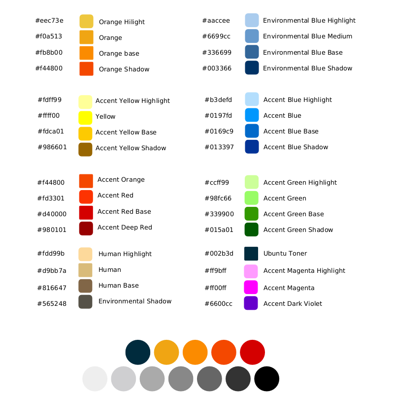
  • Red: pantone 186C / C0 M100 Y81 K4Ubuntu Palette

When you are designing icons for Ubuntu, here's a colour palette to assist you in a variety of formats:

#19

Here are mine: [IMG]http://www.smoothweb.net/logo.png[/IMG] [IMG]http://www.smoothweb.net/logosm.png[/IMG]

#20

Thanks PWill! Those are awesome!

#21

I am not very talented in the Graphic Arts dept, but the ubuntu logo itself forms an 'O'. Maybe that could be incorporated with the state name.

Mike (Northeast Ohio)

#22

feign said: I am not very talented in the Graphic Arts dept, but the ubuntu logo itself forms an 'O'. Maybe that could be incorporated with the state name.

Mike (Northeast Ohio)

Brilliant Idea!!!!!

you need to join the team! ;)

( https://launchpad.net/~ubuntu-us-ohio )

#23

I did not realise until this thread that there were such guidlines for artwork. I very much like the logo on the wiki. The wiki looks terrific!!

#24

feign said: I am not very talented in the Graphic Arts dept, but the ubuntu logo itself forms an 'O'. Maybe that could be incorporated with the state name.

Mike (Northeast Ohio)

It sounds like a good logo idea, but I fear it may also violate the trademark. The Ubuntu COF logo needs to be displayed as a separate logo entirely. ](*,)

#25

jacobmp92 said: It sounds like a good logo idea, but I fear it may also violate the trademark. The Ubuntu COF logo needs to be displayed as a separate logo entirely. ](*,)

yep